The palette
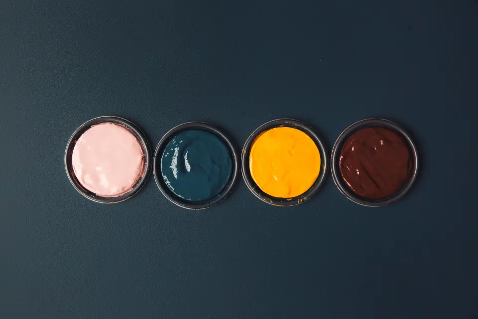
#C8952C
#C0472F
#2C4A8A
#B7C39A
#E9C6B1
Pick one hero colour
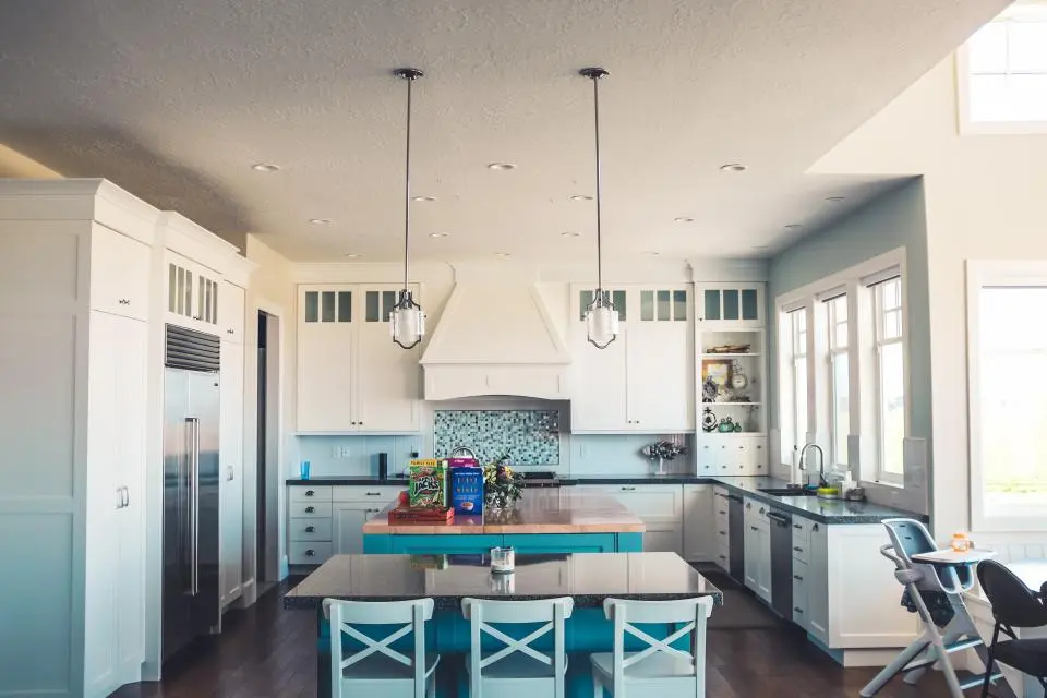
Colourful kitchens work best when one colour leads and the rest support it. Choose the hero first — a saffron yellow, a tomato red, a cobalt blue — and decide which surface carries it: the units, the island, the walls or even the ceiling.
Then pull two supporting shades from the room's fixed elements: the veining in a marble worktop, the tone of a terracotta floor, the warmth of oak open shelves. These give the hero colour something to talk to.
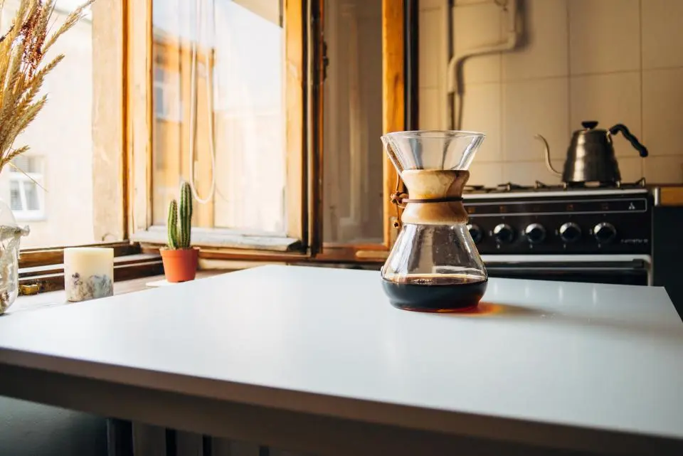
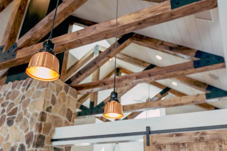
Warm light, natural timber and a pale worktop give strong colour something to sit against.
Colour combinations that work
- Saffron and navy — sunny and grown-up; navy base units with saffron walls feels instantly cheerful.
- Pistachio and blush — soft, retro and very forgiving in low light.
- Tomato red and cream — a classic country-house combination, best with brass and natural timber.
- Cobalt and white tiles — crisp, Mediterranean and great in south-facing rooms.
- Olive and plaster pink — earthy and calm; lovely with limewashed walls.
Using colour in small doses
If a fully colourful kitchen feels like a leap, use colour in places that are easy to change: a painted dresser, the back of open shelves, the inside of a larder, window frames, or a single wall behind the table. A bold ceiling is another good option — it adds personality without touching the units.
Patterned blinds, a run of coloured tiles behind the hob or a painted floor border can carry the same colour story at a lower commitment.
Light, sheen and practicality
Kitchen walls get steam and splashes, so choose a wipeable finish — a durable matt or eggshell. Strong colours often look richer in a flat finish, so look for a scrubbable matt formulation rather than a shiny one.
Remember that saturated colour bounces: a red kitchen will tint everything in it warm, including food and faces. That's usually a good thing — just check it alongside your worktop samples before committing.
Colour in a kitchen should feel like good company — lively at breakfast, warm at supper.
Frequently asked questions
What is the best colour for a small kitchen?
Mid-tones with warmth — soft greens, putty, warm whites — open a small kitchen up, but a single deep colour throughout can also make it feel cosy and intentional.
Should kitchen walls and units be the same colour?
Colour-drenching units and walls in one shade is a calm, modern look. For contrast, go lighter on the walls and deeper on the units.
What finish is best for kitchen walls?
A wipeable, scrubbable matt or eggshell designed for kitchens and bathrooms.