Start with the light
Which way does the room face? When is it used? North light cools colours; south light warms them. Choose paint at the time of day you'll use the room most.
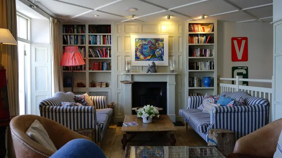
Ideas for painting, papering and furnishing homes that feel personal — from kitchen cupboard colours to tented ceilings and feature walls.
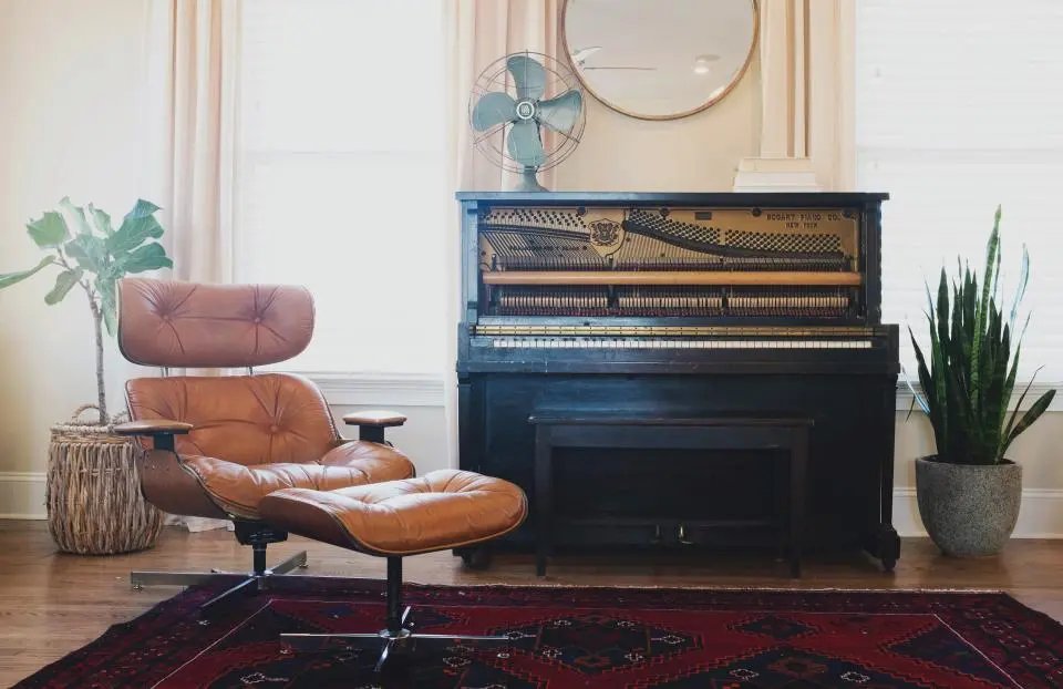
The best interiors are never a designer's showcase. They reflect the lifestyle, interests and personality of the household — and they're practical enough to live in every day.
That's the thinking behind everything we publish: interior design advice for real London flats and country houses alike, with an eye for detail and a respect for budget and timescale. Clear, honest guidance on colour, paint, wallpaper and the finishing touches that make a room feel complete.
About the journal →Which way does the room face? When is it used? North light cools colours; south light warms them. Choose paint at the time of day you'll use the room most.
A scheme hangs together when one colour leads and two others support it — repeated across walls, fabrics and accessories.
Ceilings, woodwork and the insides of cupboards are where a good room becomes a memorable one.
Paint big sample boards, tape up wallpaper lengths, and live with them for a week. The right choice usually reveals itself.
Earthy, warm and sociable — lovely in kitchens and dining rooms.
The great calm-maker. Works with oak, linen and brass.
A deep neutral. Try it on kitchen units or a study ceiling.
Bottled sunshine for north-facing rooms.
Soft, skin-warm and surprisingly grown-up.
Rich and enveloping — beautiful in bathrooms.
Candlelit drama for dining rooms and snugs.
The warm white that flatters everything.
Not one room should be the same, because no two households are. Colour is how a house starts to tell you who lives there.
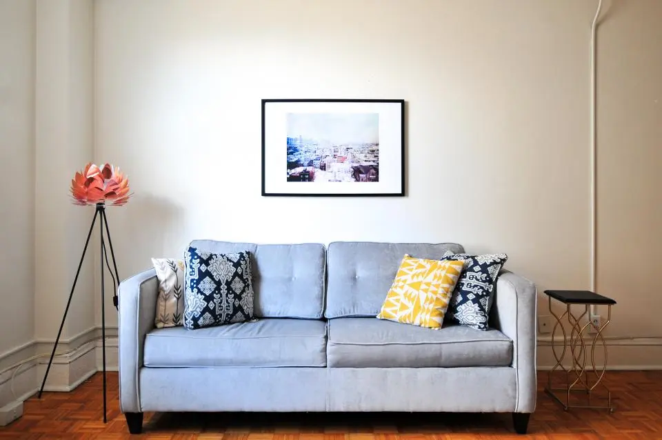
The same sofa, the same print — a completely different room. Tap a colour to see how the wall changes the mood.
Sage — calm and easy to live with, and lovely with pale blue.
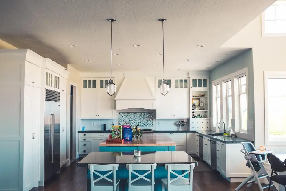
Kitchen cupboard paint ideas and a step-by-step method for painting cabinets with a durable, brush-mark-free finish —…
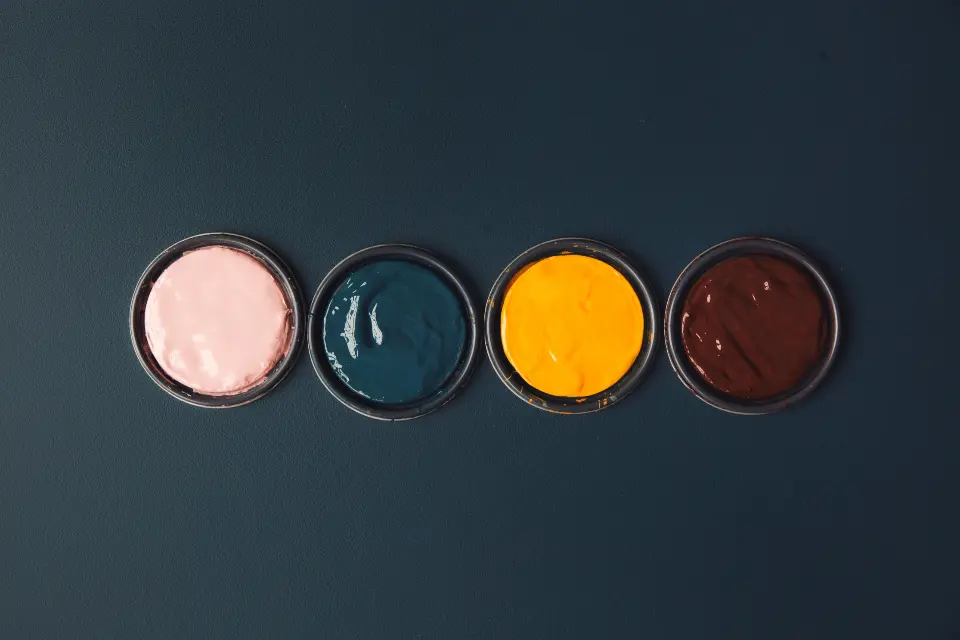
Colourful kitchen paint ideas — how to choose bold colours for kitchen walls, units and islands, and how to balance…
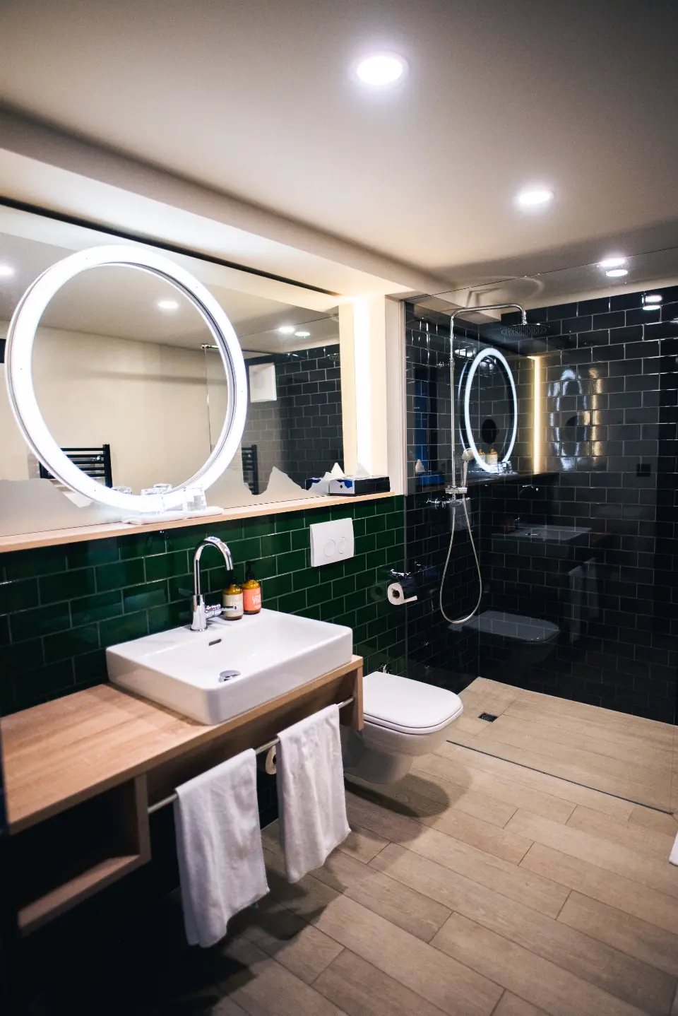
Bathroom wallpaper ideas — which papers survive steam, where to hang them, pattern ideas for small bathrooms and…
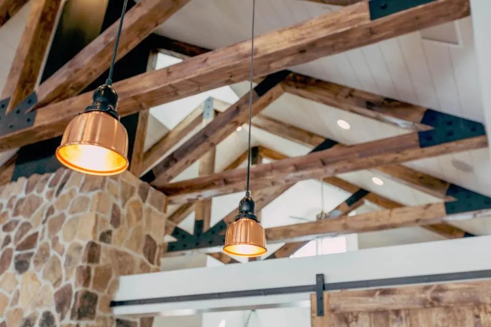
Ceiling design ideas — painting a ceiling dark, tented fabric ceilings, wallpapered ceilings, colour-drenching and…
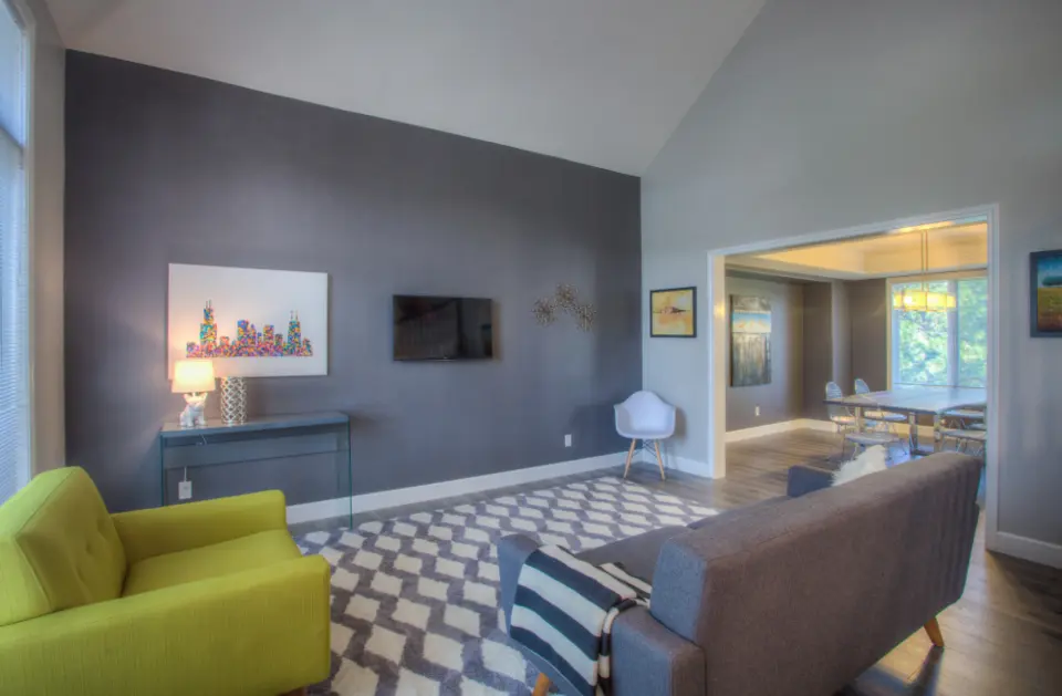
Feature wall ideas for bedrooms and living rooms — paint, wallpaper, panelling, murals, colour blocking and choosing…
Questions about colour, paper or a scheme you're planning? Write to us.
Get in touch →